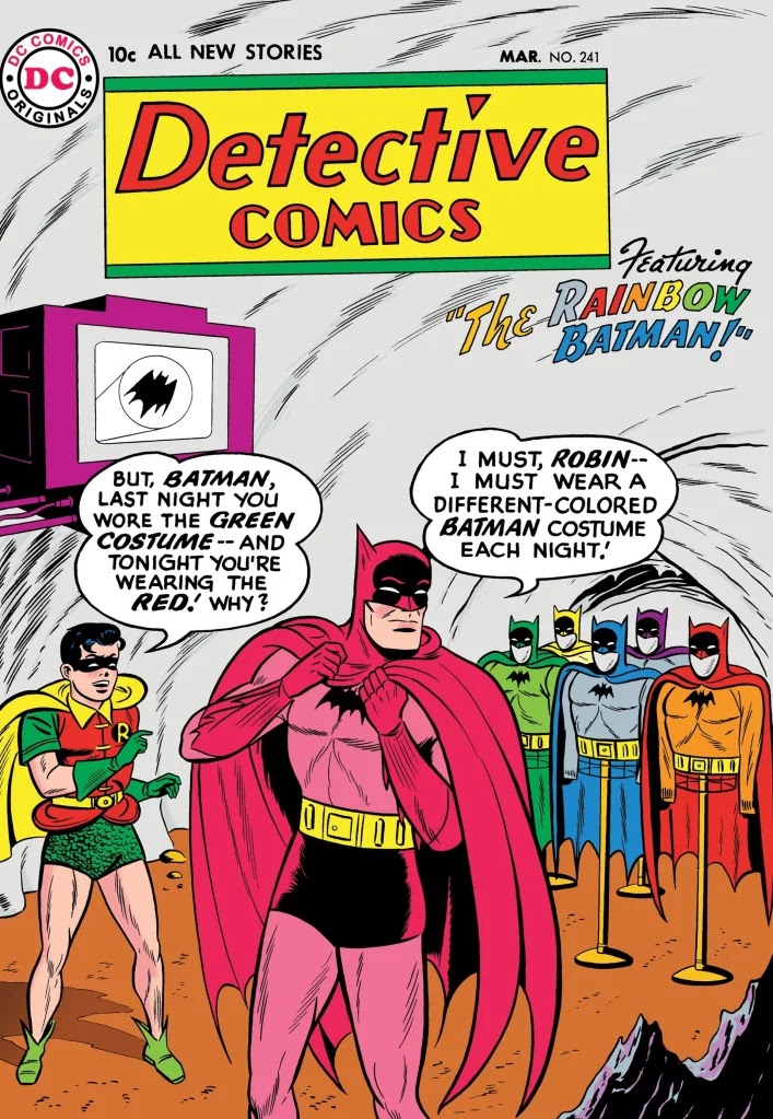
Batman, then, despite his handsome face and ripped body, is at heart a grotesque, because the very look of his costume inspires fear more than admiration. Robin’s costume, in contrast, evokes the fanciful spirit I term arabesque. He affects bright daytime colors of red, green and yellow in direct contrast to Batman’s night-hues-- DARK GROTESQUES AND COLORFUL ARABESQUES, 2020.
I want to re-emphasize my qualifications of this statement in Part 1, that these characterizations are what I believe to be the DOMINANT ways in which audiences relate to "grotesque" and "arabesques." But to ground my characterization a little more, I should draw upon the more general terminology of colors.
The standard division is as follows:
(1) Red, yellow and orange are "warm" colors, said to enhance positive and invigorating emotions.
(2) Blue, green, and purple are "cool" colors, said to bring relaxation and thus somewhat negative feelings.
(3) Black, white and grey are "neutral" colors, that evoke neither positivity nor negativity.
Now, to go back to my initial examples of Batman and Robin, both mix hues in different categories.
What I called "daytime colors" in Robin are two "warm colors," red and yellow, and one "cool" color, green, though I think it inarguable that the two warms trump the one cool.
Batman is a little more complicated, as described in this thorough 2013 essay on a sadly defunct site, GOTHAM ALLEYS. His original costume was dominated by two neutral colors, grey and black. However, on the comics page the black was rendered with blue highlights, and over time the colorists reversed this practice, so that the black parts of the costume became blue with black highlights. (One comment on the essay even claims that "black highlights" are impossible, though obviously he's speaking of real life, not art itself.) So the accepted Batman attire is dominantly one neutral color and one cool one, with some slight mitigation by the warm color of the utility belt.

Now, the standard attribution of "cool colors" doesn't speak of "negativity" as such. Yet when one thinks of the chosen color-scheme for the Famous Monsters of Cinema-Land, many of them are dominated by neutral or cool colors. I believe this is because the horror-genre associates such "calming" colors with such macabre connotations, associated with death, pain, and other mortifications.

The "magical fantasy" genre is in many ways the polar opposite of horror, and I would generalize that fantasies usually privilege warm colors. using the cool ones largely as contrast. Because magical fantasies tend to be insular, there's no familiar grouping of icons that are regularly associated in pop culture, but the 1939 WIZARD OF OZ is probably best known for using bright, vivid colors as an express revolt against the dull neutral colors of "reality."

So these are the sort of dominant associations I find with the use of coordinated color-patterns as they occur in popular culture. (The patterns may well apply to canonical "high culture" as well, but that would require something less like a blogpost and more like a Camille Paglia Guide to Color-ology.) In my next post I'll examine how the visual tropes of the grotesque and the arabesque apply to broader categories of authorial will.
No comments:
Post a Comment